Sando Paradiso
Client/Partners
Hen’s Teeth
Year
2025
Project Type
Brand identity
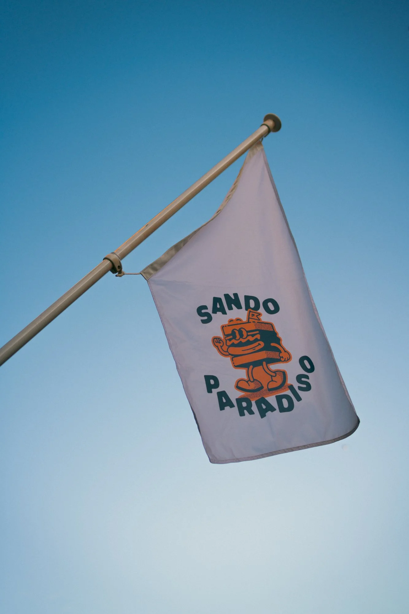
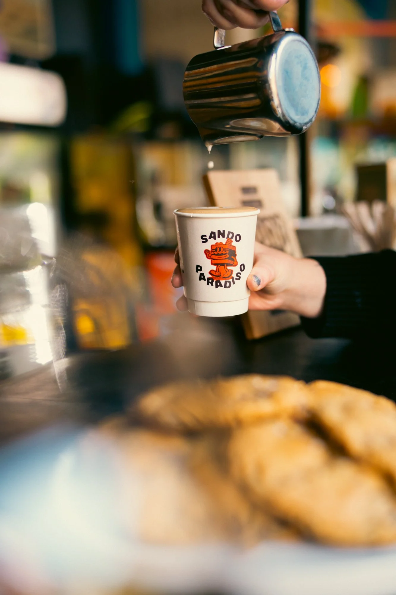
Sando Paradiso is a new Japanese-style sandwich spot at Hen’s Teeth. The brand needed an identity that felt fresh, playful, and inviting - something that would stand out in a crowded food scene while celebrating the simple joy of a really good sandwich.
My role was to shape the full visual identity from the ground up. I developed the logo, color palette, and core graphics, and of course the illustration of the sandwich guy. The result is a brand that works alongside Hen’s Teeth usual broadcast, with enough personality to translate across packaging, menus, and digital platforms.
![HT-SandoP-Coming-Soon[1]-10.png](https://images.squarespace-cdn.com/content/v1/66721fcf02d9063005d7c976/f0eb1baa-87dc-4a23-b6fc-440cdcd8ca68/HT-SandoP-Coming-Soon%5B1%5D-10.png)
![HT-SandoP-Menus-Social-Aug25[1]-01.png](https://images.squarespace-cdn.com/content/v1/66721fcf02d9063005d7c976/cc601c83-4bec-40d5-a0f9-3e1869cc5203/HT-SandoP-Menus-Social-Aug25%5B1%5D-01.png)
![HT-SandoP-Menus-Social-Aug25[1]-02.png](https://images.squarespace-cdn.com/content/v1/66721fcf02d9063005d7c976/9cb3912b-782e-436d-b543-222337ecc8bc/HT-SandoP-Menus-Social-Aug25%5B1%5D-02.png)
![HT-SandoP-Shots-Aug25[1]-05.png](https://images.squarespace-cdn.com/content/v1/66721fcf02d9063005d7c976/cea1ff4c-6085-41bf-a609-26c75c49317f/HT-SandoP-Shots-Aug25%5B1%5D-05.png)
![HT-SandoP-Shots-Aug25[1]-07.png](https://images.squarespace-cdn.com/content/v1/66721fcf02d9063005d7c976/ce2cfe40-5a1f-46a3-b0cc-05297d429a4b/HT-SandoP-Shots-Aug25%5B1%5D-07.png)
